Kemsolid solutions
TSM solutionKemsolid solutions
TSM solution
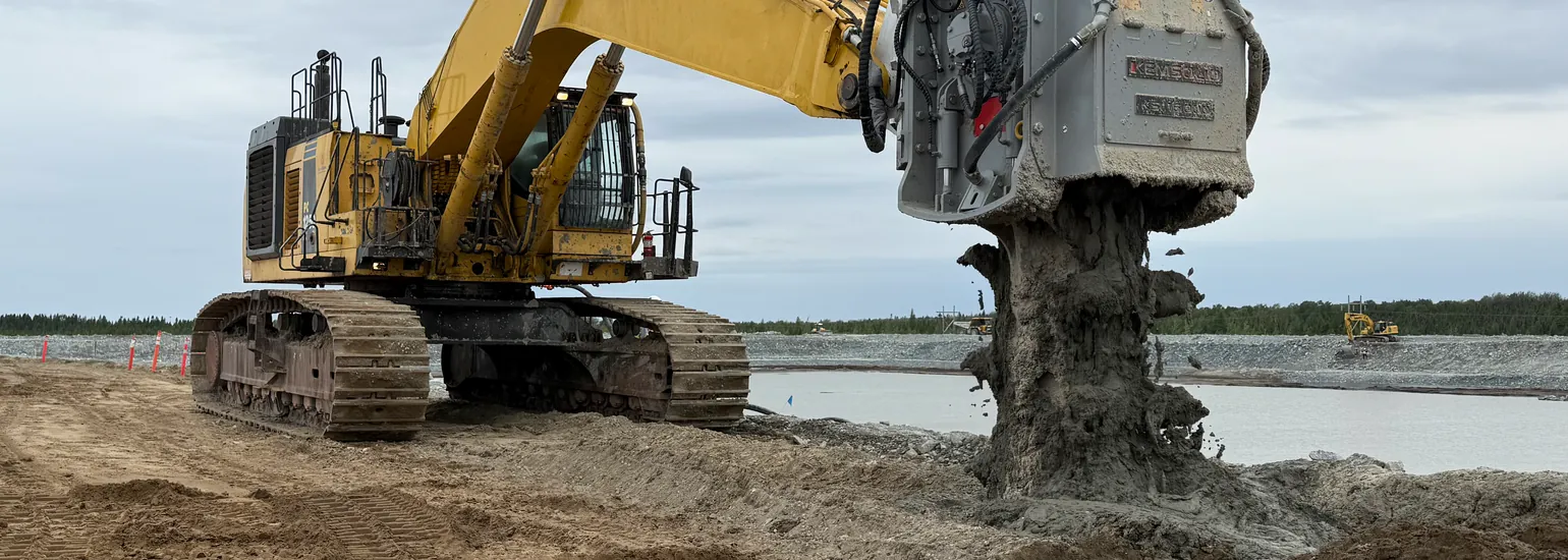
The TSM or Trench-Soil-Mixing is a method of creating in-situ soil-cement structures.
MSM solution
The MSM or Mass-Soil-Mixing is for a sub soil improvement and soil stabilisation techniquee.
CFA solution
The CFA or Continuous-Flight-Auger is used to produce in-situ concrete piles.
Custom-made solutions
Mixing tools built for your job when no catalogue size fits.
A working draft of the Kemsolid website, generated from a written set of design rules rather than drawn by hand. Every measurement on this page follows from one number, and every rule behind it is written down.
It is not a proposal for the content. The bands, the navigation and the typography are the subject.
This page, MSM solution and KDM range. Those three links in the menu work; every other entry leads nowhere.
They are set as links anyway, so that the navigation shows what it will look like when the site is finished. Nothing is missing there — the pages behind them are.
The geometry lives in about twenty CSS custom properties. A theme that imports them and derives from them keeps the design; a theme that copies pixel values loses it at the first change.
The recommendation is a classic theme, not a page builder. A builder stores spacing per element in the database, and a system whose core claim is one number and everything else a ratio cannot survive that.
The simplest option is that the theme comes ready made, built by Andy together with the rules it implements. A theme is a folder: uploaded as a zip file, activated, done. It carries its own fonts, its own logo and its own generated values, so it depends on nothing outside your installation and needs no plugin.
Your own additions go into a child theme. They then survive every update of the parent, and an update never overwrites your work.
The division would be: form and rules with Andy, content and operation with you. The point of that split is not control but cost — rules that are built into a file do not have to be read in order to be followed.
The height of a band is called H. On this screen it is 28 pixels, 24 on a tablet, 20 on a phone. Nothing else on the page is set independently.
The gap inside a band is H/4. The protective space around any element is H/2. The corner radius is H/8. The page measure and the outer margins fall out of the same relation.
Change H and the whole page follows. There is no second place to edit.
The head band is the one element that appears everywhere, unchanged and in the same place. It carries the navigation and the sign, and nothing else. A visitor learns it once and never has to read it again.
It does not grow. Two things stand in it, and a third would have to take the place of one of them rather than squeeze in beside it. A search field, a language switch, a phone number — each is a fair candidate, and each costs the other two their room. That is one decision for the whole site, not a question per page.
On a phone it keeps both, at a smaller H. Nothing is dropped and nothing is stacked, because an element that disappears on a small screen was never carrying anything.